What you need to know about chemistry in fashion: The Color Wheel
A bit of color, chemistry and behavior.

Written by Suellen Tozetti*


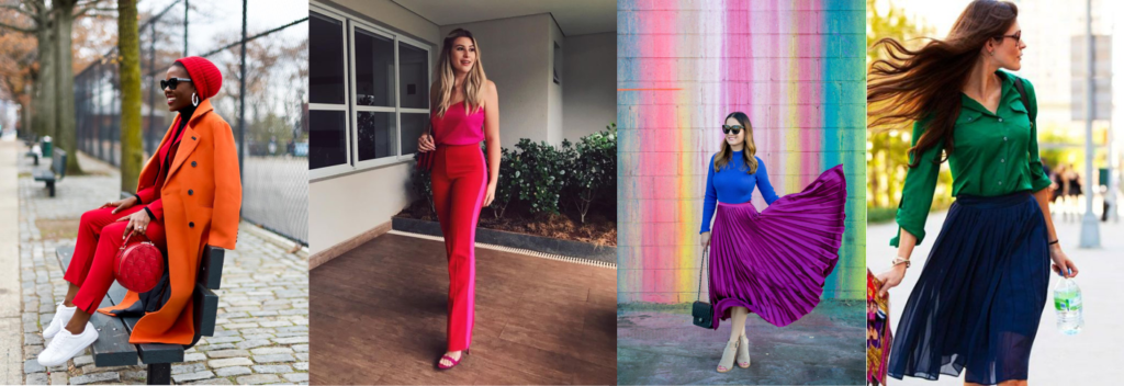
            In the times of pandemic, people had to readjust their realities once they were forced to stay in isolation. Therefore, moments of self-knowledge were necessary to reach a point of balance between reason and emotion. Due to the new dynamics, people started to seek comfort to cope with teleworking, taking care of children and doing housework altogether. In addition, people started to wear a wider variety of colors, not only because they have the power to differentiate looks, but they are also able to change our mood.


The The color wheel, a widely used tool by designers, fashion consultants, architects, stylists, makeup artists and several professionals, helps us to find harmony among colors. Understanding how it works may be the key point to develop countless ways of getting dressed, for instance, portraying our personality or the mood of the day. uma ferramenta amplamente utilizada por designers, consultores de moda, arquitetos, estilistas, maquiadores e muitos profissionais, nos ajuda a encontrar a harmonia entre as cores. Entender seu funcionamento, pode ser o ponto chave para elaborar incontáveis propostas do vestir, por exemplo, comunicando nossa personalidade ou o day’s mood.


Above all, dear reader, I invite you to understand the Color Wheel. Shall we learn the color’s concept through a chemical perspective? This brief pause may turn out to be really interesting…


After all, what is a color?


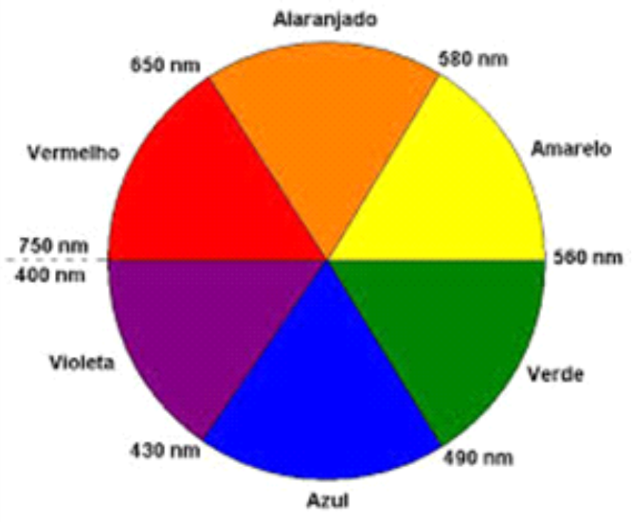
In order for us to have color perception,what we are observing must absorb visible lightThis consists of electromagnetic radiation, whose wavelengths vary from 400 to 700 nm (Picture 1). White light contains all wavelengths in that visible region.

Picture 1. Color Wheel, along with complementary colors and wavelengths intervals.


Color is the perception resulting from the sum of colors that are reflected or transmitted by the bodies and reach the eyes, when a body absorbs visible light..


Imagine that an object absorbs all wavelengths of visible light. In this case, no wavelength reaches our eyes from that object. As a result, we see it black. On the other hand, if an object does not absorb visible light, we have a white or transparent object.


The other colors can be observed in two specific situations: (a) when the object reflects or transmits light in that color; (b) or when it absorbs light in the complementary color.


For example, we can observe a yellow object, if it absorbs all wavelengths except yellow (hypothesis a), or even, if it absorbs in violet - a complementary color to yellow (hypothesis b).


Do you understand why using natural light when an image consultant will check his client's personal coloring? Natural light covers all wavelength bands of visible light. Hence, the colors he will observe will be as accurate as possible.


With this chemical perspective in mind, let's go back to the Color Wheel to understand how we can apply it to harmonize our looks?


Color Wheel and its applications


The Color Wheel is a circular chart composed of twelve parts that represent the colors formed from the primary colors. This tool is particularly useful to combine colors that harmonize, but they aren’t always that obvious.

Primary colors: blue, yellow and red;

Secondary colors: created from the combination between two primary colors - green, orange e violet.

Tertiary colors: created from the combination between a primary color and a secondary one.


Now that we are aware of the colors formation, how are we supposed to arrange them?

Based on the colors’ harmony we can create looks that portray exactly our personality or even our day’s mood.

Monochromatic Harmony: Based on a part of the Color Wheel. In this type of harmony, the idea is to create a look composed of a single color, often varying only its tones. As a visual effect there is a silhouette stretching. This type of look conveys sophistication and elegance.

Image: Pinterest

Analog Harmony: based on a main color and the other two adjacent to it. It results in a contrasting visual effect, but at the same time discreet and youthful. Example: orange and red, pink and red, violet and blue, green and blue.

Image: Pinterest

Complementary Harmony: it would be the combination of directly opposite colors in the Color Wheel. As a result of the high contrast, we come across a modern and casual visual effect. Communicative people frequently promote this type of combination, even if it’s in an intuitive way. Complementary looks: green and red, yellow and blue, violet and yellow.

Image: Pinterest

Triad Harmony: as the name suggests, it would be the combination of three colors, equidistant from each other in the Color Wheel. This type of harmony tends to provide color combinations that make the look more cheerful and informal. Besides, it portrays creativity and boldness. Triad looks: green, orange and blue; green, violet and orange; yellow, blue and pink.

Image: Pinterest

Taking the harmonies presented into consideration, the golden tip is choosing a main color and adding the others in the details. It is also worth varying the textures textures to promote an interesting visual effect and add fashion information to the look.

Eventually, I would like to say that we shine light all the time, so don't accept being less than an enlightened person, let's be light and shine wherever we are! Don't forget to tag us on Instagram (@analicetozetti) so that I can see your amazing looks!!


Xoxo, Ana and Su!


Mini-Curriculum of the main writer of this text:

* Suellen Tozetti is a Chemistry graduate from UFRJ with a master's and doctorate in Science from UFRJ, and will collaborate with the section “Chemistry in fashion”, from Analice Tozetti's website / blog.


References:


https://www./wefashiontrends.com/como-combinar-cores-com-ajuda-do-circulo-cromatico/. Acess on 08 dec. 2020.


https://ecolebrasil.com/aprenda-a-usar-o-circulo-cromatico-e-varie-as-opcoes-de-look/. Acess on 08 dec. 2020.


Brown, T. L., LeMay, H. E., Bursten, B. E., Burdge, J. R. Química, a ciência central. São Paulo: Prentice Hall, 2005.


Figura 1: Extraída de http://qnesc.sbq.org.br/online/qnesc35_1/06-EEQ-79-11.pdf. Acess on 08 dec. 2020.


Figuras 2 e 3 adaptadas de: http://blog.eduk.com.br/post/circulo-cromatico-na-maquiagem/. Acess on 09 dec. 2020.

Post a Comment